It’s a little known fact that well designed titles/straps/lower-thirds/astons/whatever you want to call them, can increase the perceived production value of your video exponentially. Even if you’re not a whizz at After Effects, these tips should help.

-
Before you start, ensure you have your brand’s correct, up-to-date brand guidelines to start from. Often you’ll find these take away some of the tricky design decisions.
-
If time is tight on your edit (or you just like being organised), design your titles in advance and get approval from the client for them. Titles are the number one amendment clients will want to make.
-
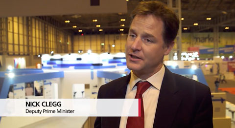
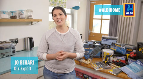
Get it right - nothing looks worse to a client than you misspelling their name, their colleagues’ names or their company name. I always try to triple check against the notes I have to ensure this is correct. You’re not always going to get it right and I am definitely testament to that!
-
When interviewing subjects, I always get them to spell their name and their job titles’ out as no-one knows how to spell their name better than themselves! I’ll admit this isn’t always 100% accurate though as under-pressure, interviewees can spell their names wrong or pronounce some letters unclearly.
-
Start in After Effects - Easing and motion blur make a title look far more slick. Premiere Pro can ease but can’t motion blur (properly!). I like to design the bottom layer of graphics in After Effects, render out with alpha channel and import into Premiere Pro. Here I can then place the text above the base layer and transition it in over the top. Even a newbie to After Effects should be able to crack this. Here’s a tutorial on basic key framing and here’s a tutorial on adding motion blur.
-
Look at basic typography to make the titles look more premium. Things like good kerning and tracking, ensure that the letter-spacing is appeasing to the eyes. Knocking the letter spacing back to -1 to -2 (depending on the font obviously), makes it look much more premium. Never let characters overlap though.
-
Separate different elements in the titles using text-decoration (bold, underline, etc.), colours and case. I may for example, have the person’s name slightly larger in a darker colour and I’d then have their title in a slightly smaller font size and in uppercases.
-
Keep it simple - In the UK we tend to go for clear, easy to read graphics which do what they say on the tin (but nicely!). Try not to get too distracted with the American over-designed, over-animated graphic style which can jar with an English audience.